Blog Layout

Paint Colour Trends for 2023: What is Hot

Painters and Decorators Manchester • June 3, 2023

Painters and Decorators Manchester have examined the decorating and paint trends for 2023. Our research shows these can be divided into two distinct categories: embracing bold and vibrant choices or opting for a more neutral aesthetic. These contrasting styles offer individuals the opportunity to explore various approaches based on their personal preferences and desired atmosphere within their living spaces.


In terms of vibrant color choices, the current trend revolves around luxurious shades of green, deep blue, rich red, and warm burnt orange, adding a touch of drama and coziness to any room. One popular technique for creating visually striking interiors is "color-blocking," which involves using two or more contrasting tones.


When it comes to a more subdued color palette, nature remains a significant source of inspiration. Neutral hues found in the great outdoors, such as mushroom, dried grass, cloud, and seafoam, are expected to dominate the realm of interior design in the upcoming year.


To stay updated on the latest paint trends for 2023, follow comprehensive guide below created by our painters and decorators in Manchester.


Exploring the Allure of Inky Blues


The enduring popularity of navy blue shows no signs of waning, but this year Painters and Decorators Manchester are witnessing a shift towards deeper, more opulent shades of dark blue. Picture the depths of the ocean, with its captivating hues, and consider incorporating these rich tones in a harmonious manner by extending the color to furniture and fabrics.


Another appealing approach is to combine various blue shades, as they complement each other splendidly and offer ample opportunities for mixing patterns. For instance, in a living room, you can pair inky blue walls with indigo striped curtains and cobalt patterned cushions for a visually captivating ensemble.


Blue has long been a favored choice for living room decor, as it effortlessly creates a serene and refined ambiance in a typically bustling space. Helen Shaw, the UK Director for Benjamin Moore paint, highlights the allure of their "Starry Night Blue," a radiant shade resembling the deep indigo hues of twilight. The touch of violet undertone adds a touch of sophistication, while still retaining a playful aspect, particularly when applied with a Satin finish. This color can also serve as a refreshing alternative to navy when used on cabinetry.


Harmonious Combination of Simple Colors


Take inspiration from colour-blocking, still found to be popular in the fashion world, and think about dressing your kitchen like you would pull an outfit together! One colour for the top and another for the bottom, with a little injection of colour for accessories - like this pop of yellow. 


Joa Studholme, Colour Curator at Farrow & Ball explains how to achieve this, ‘The biggest overall paint trend in 2023 will be about how we use colour as much as the colour itself. The use of stronger, simpler colours is extremely popular. Eclectic mixes evoke the warmth and harmony of a more innocent age’. 


She goes on to say, ‘this can be achieved by using two colours on one wall – easy if you have panelling or a dado rail, but if not then arm yourself with masking tape and just paint the bottom third of the wall in one colour and the top two thirds in another. 


Exploring the Luxurious Appeal of Rich Neutrals


Indulging in the comforting embrace of a steaming mug of hot chocolate or a delicious caramel latte is a pleasure that evokes a sense of coziness. It comes as no surprise, then, that these warm and inviting colors are increasingly making their way into the popular neutral palette. A quick scroll through Instagram reveals countless living rooms adorned in these rich neutrals, and now these captivating tones are making their presence felt in kitchens and bathrooms as well.


According to Andy Greenall, the Creative Director at Paint & Paper Library, there is a noticeable shift away from the impersonal and stark bright whites often seen in kitchen designs. Instead, there is a growing emphasis on creating more thoughtful and cohesive design schemes that align with the overall interior aesthetic of a home. This approach involves using richer, mood-setting colors to great effect, incorporating them across woodwork, cabinetry, and walls.


One such versatile and warm neutral shade is 'Mink,' which boasts a subtle pink undertone that adds depth and warmth to kitchen walls. For a sophisticated and timeless scheme, Greenall suggests pairing 'Mink' with the enigmatic and deep red-brown hue called 'Scarlet 'n' Rust.'


Discovering the Beauty of Hand-Painted Murals


In our quest for individuality and the desire to infuse our homes with a personal touch, sustainability takes center stage, leading to a rise in upcycling and a greater embrace of the "make-do-and-mend" mindset. Amidst this trend, there is no better way to create an eye-catching focal point on a budget than by painting a unique mural that is bound to ignite conversations among visitors.


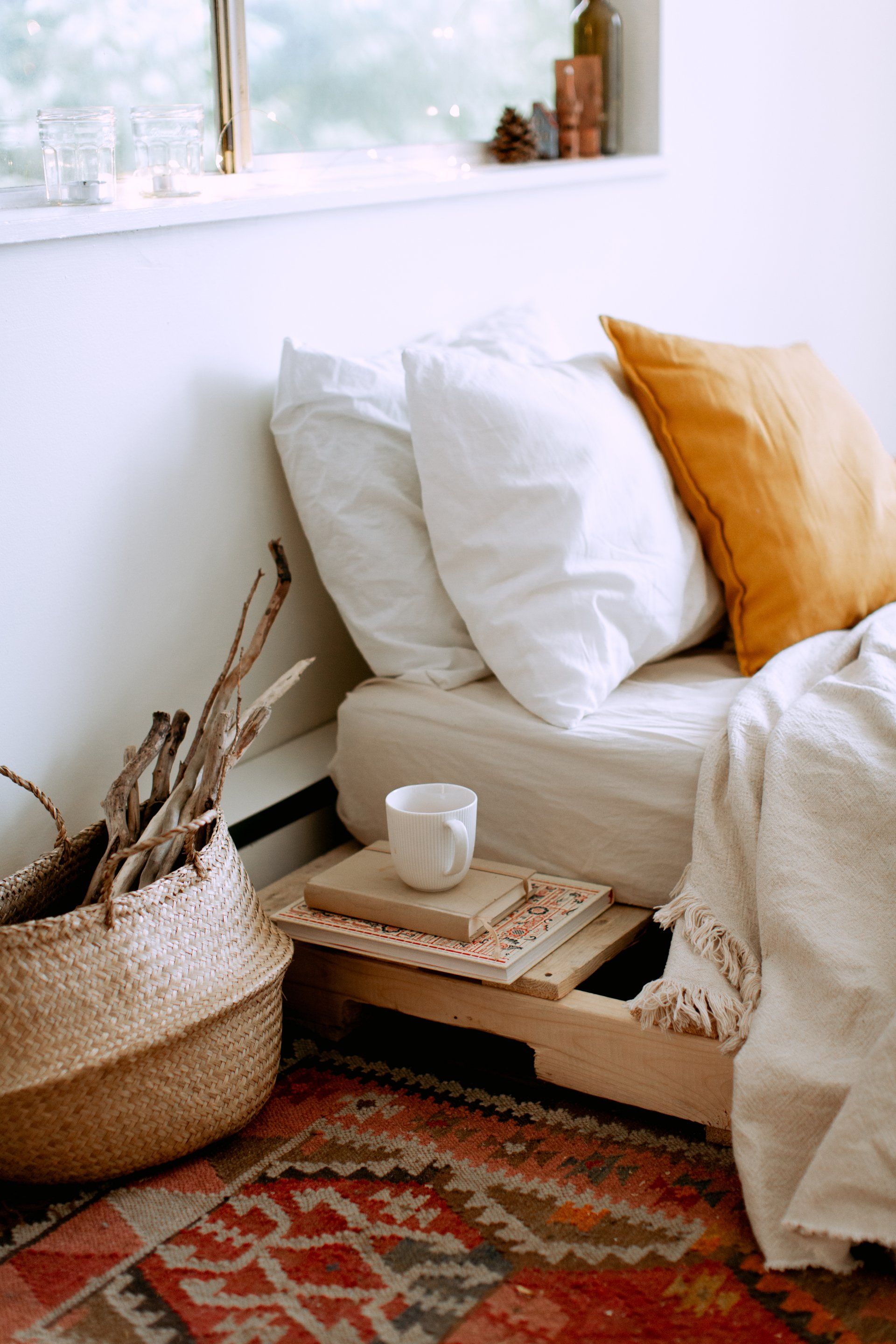
Introducing pastel hues into your home can have a transformative effect, infusing the space with uplifting energy and invigorating the ambiance. To avoid an overly sweet or saccharine appearance, opt for soft pinks, mustard yellows, and dusky teals instead of pure white-based shades. Pastel colors possess the unique ability to strike a balance between darker, bolder hues and more subtle neutrals, making them a versatile choice for creating a visually engaging environment.


Combining Matte and Gloss Finishes


An excellent technique for adding dimension and captivating visual appeal to a flat wall is to combine matte and gloss paints in the same color. By experimenting with different patterns such as a checkerboard design, alternating stripes, or zoning specific areas, you can achieve remarkable results.The variation in paint finishes introduces a play of light that reflects off the surfaces to different degrees, effectively transforming an otherwise plain wall into a captivating feature.


Painting Ceilings


The trend of painted ceilings, popularized by interior designers like Abigail Aherne, continues to make waves in 2023, this time with a focus on vibrant color accents. If you feel that your ceilings are too low and confining or excessively high and lofty, painting them can significantly alter the overall ambiance of a room.


To create the illusion of a lower ceiling height, consider extending the paint from the ceiling onto the walls, stopping at the approximate height of a picture rail. This technique effectively blurs the boundaries between the wall and ceiling surfaces, visually harmonizing the space. It can also add interest to an area that lacks architectural details, infusing it with a unique charm.


Yellow, known for its optimistic and feel-good qualities, holds a special place when it comes to ceiling colors. Applying a bright and sunny shade of yellow on the ceiling replicates the warm and cheerful glow of natural sunlight, particularly in rooms that may lack ample light.


Tri-Color Room Design


When it comes to painting a room, there are three essential elements to consider: the walls, the woodwork (such as skirting boards and trim), and the ceiling. In the upcoming year, the trend of opting for safe, white skirting boards is set to be replaced by a bolder approach of highlighting them with vibrant contrasting colors. Research conducted by Painters and Decorators Manchester shows we are definitely going to see braver choices in using colour to highlight woodwork in 2023.


Exploring Reds with Pink Undertones


As we delve into 2023, deep reds maintain their popularity as a favored choice for paint. However, this year brings a fresh twist with the emergence of reds infused with powerful pink undertones. Among the noteworthy color selections, Benjamin Moore Paint has declared "Raspberry Blush" as its Color of the Year—a vivacious coral shade with captivating hints of pink. Additionally, Pantone has named "Viva Magenta" as its Color of the Year, showcasing a transformative crimson red with delightful raspberry undertones.


This year, we wholeheartedly embrace these warm hues, utilising them in various applications to make bold statements. They can be employed to envelop entire rooms, exuding a sense of vibrancy and setting a striking tone. Alternatively, these captivating shades can be used in smaller doses to bring character and excitement to specific areas, such as front doors, kitchen islands, or even stairways. These strategic accents create a daring aesthetic that emanates energy and enthusiasm


The Charm of Dusky Pink


In recent years, the allure of earthy pink tones has captivated us, offering a sense of comfort and warmth to our interior spaces. This enduring trend shows no signs of waning as we enter 2023.


The current shift in earthy pink tones moves away from the realm of baby pinks and soft white pinks. Instead, a captivating blend of blush and beige emerges, resulting in a grounding shade of pink that holds a unique charm.


This blend of blush and beige creates a sophisticated and serene ambiance. The resulting earthy pink hue brings a subtle warmth to interiors, evoking a sense of tranquility and connection to nature. Its versatile nature allows it to seamlessly complement a variety of design styles, making it a go-to choice for those seeking a harmonious and inviting atmosphere.


The Soothing Influence of Neutral Tones


Building upon the cocooning concepts of 2021, the minimal approach to interior design continues to flourish in 2023, offering spaces that serve as retreats for relaxation and comfort. Soft neutrals play a pivotal role in this design philosophy, infusing rooms with a soothing warmth and a touch of organic green. To complete the look, a contrasting unsaturated black-brown is introduced, adding depth and visual interest.


These soft neutrals create an inviting ambiance, evoking a sense of tranquility and cosiness. With their understated elegance, they provide a backdrop that allows other elements in the room to shine while maintaining a harmonious and balanced atmosphere. The subtle incorporation of organic green adds a natural touch, enhancing the overall serenity and connection to the environment.


Embracing the Splendor of Glossy Finishes


Traditionally, gloss finishes have been commonly associated with rooms that experience higher moisture levels, such as bathrooms. However, a fascinating trend has emerged, where gloss finishes are now being employed to infuse various rooms throughout the house with a touch of drama and visual allure. The high sheen and reflective nature of gloss can work wonders, making dark or smaller spaces appear more expansive and inviting.


The application of gloss finishes in unexpected spaces breathes new life into interior design, unlocking fresh possibilities for creating visually striking and spacious-looking rooms. Its ability to amplify natural and artificial light adds depth and dimension to any environment, transforming the perception of size and enhancing the overall aesthetic appeal.


Contact Painters and Decorators Manchester for professional painting and decorating advice and your free competitive quote.

You might also like

By Elite Edge Painters and Decorators Manchester October 19, 2024
Elite Edge Painters and Decorators Manchester advice that as we move into the heart of autumn, many homeowners in Manchester are looking for ways to spruce up their interiors before the busy holiday season arrives. Whether you're preparing for family gatherings or just want to give your home a fresh look, choosing the right paint finish is essential—especially for those high-traffic areas like hallways, kitchens, and living rooms. Not all paint finishes are created equal. When it comes to areas of the home that see a lot of daily use, you’ll want something that’s both durable and easy to clean, so it can withstand the inevitable scuffs, spills, and wear and tear. Here’s a guide to the top 5 paint finishes perfect for high-traffic areas in Manchester homes: 1. Satin Finish Satin is one of the most popular paint finishes for high-traffic areas, and for good reason. It offers a soft, velvety sheen that looks elegant, while also being highly durable. Its smooth surface makes it easy to wipe down, which is perfect for those places in your home that see a lot of activity, such as hallways, children’s bedrooms, and kitchens. Satin paint is a great choice for Manchester families with busy lifestyles. The finish is tough enough to resist scuffs and fingerprints, and it can be cleaned with a damp cloth without losing its shine. It strikes the perfect balance between beauty and practicality, making it a go-to for many homeowners. 2. Semi-Gloss Finish If durability is your top priority, then semi-gloss paint may be the best option for you. Semi-gloss has a higher shine level than satin, making it even more resistant to moisture and stains. This finish is ideal for spaces like bathrooms, kitchens, and entryways, where surfaces are more prone to water splashes, grease, and dirt. One of the biggest benefits of semi-gloss paint is that it’s incredibly easy to clean. A quick wipe with a sponge and soapy water will take care of most stains, making it the perfect choice for homes with young children or pets. The added sheen also reflects light, giving a bright and fresh look to darker rooms—something especially useful for Manchester homes, where natural light can be limited in the autumn and winter months. 3. Eggshell Finish Eggshell offers a more subtle finish than satin or semi-gloss, with a slight sheen that’s just enough to provide a bit of dimension without being too reflective. It’s a popular choice for living rooms and dining areas, where you want a soft, polished look without sacrificing durability. Eggshell paint is known for its toughness and versatility. It’s more washable than matte finishes but doesn’t have the same shine as satin or semi-gloss, making it an excellent choice for walls that need to handle daily wear and tear but don’t require the high-gloss treatment. In Manchester homes, where family gatherings and entertaining are frequent during the holiday season, eggshell ensures your walls stay looking fresh and can easily be touched up if needed. 4. Matte/Flat Finish with Scrubbable Formulas Traditionally, matte or flat finishes were avoided in high-traffic areas because they were prone to showing marks and stains. However, advances in paint technology have changed that. Scrubbable matte finishes are now available, providing the rich, non-reflective look of a matte finish but with the added bonus of being washable. This type of finish is ideal for areas like living rooms or bedrooms where you want a sophisticated, soft look but still need some resilience against scuffs and smudges. The matte appearance absorbs light, hiding imperfections on the wall, which is great for older homes or uneven surfaces often found in Manchester's period properties. With a scrubbable matte paint, you can now enjoy that sleek, modern aesthetic without worrying about constant touch-ups. 5. High-Gloss Finish While not as commonly used on walls, high-gloss paint is a fantastic choice for trim, doors, and cabinets in high-traffic areas. This finish is incredibly tough, offering maximum durability and a shiny, reflective surface that’s extremely easy to clean. High-gloss paint can withstand frequent cleaning, making it ideal for areas that get a lot of contact, like skirting boards, door frames, and window trims. In Manchester homes, where the weather can be unpredictable and muddy boots and wet coats are a common sight, high-gloss is perfect for protecting areas like entryways and mudrooms. The extra shine adds a pop of brightness to a space, making it not only practical but also visually appealing. Conclusion When choosing the right paint finish for high-traffic areas in your Manchester home, durability and ease of maintenance should be at the top of your list. Whether you opt for the sleek look of satin, the high shine of semi-gloss, or the sophisticated matte finish, these options will ensure your home stays looking fresh and beautiful even through the busiest seasons. So, as you prepare for the upcoming holiday season, consider giving those high-traffic areas the attention they deserve with the right paint finish. Not only will it refresh your home’s look, but it will also make cleaning up after festive family gatherings that much easier! Contact Elite Edge Painters and Decorators Manchester today for professional guidance and your free competitive quote.
By Elite Edge Painters and Decorators Manchester September 27, 2024
How the Right Paint Colors Can Boost Your Mood During the Darker Months Elite Edge Painters and Decorators Manchester advise that as the days grow shorter and the skies over Manchester take on a familiar grey tone, it’s easy to feel the effects of the changing season. Autumn and winter, while cosy in their own right, often bring darker mornings, earlier evenings, and a decrease in natural sunlight, all of which can have an impact on our mood. But one powerful way to combat the seasonal gloom is through the strategic use of color in your home. The right paint colors can brighten up a room, improve your mental well-being, and make your space feel warm and inviting—even when it's dreary outside. In this blog post, our painters and decorators in Manchester will explore how color psychology can influence your mood and suggest some of the best uplifting paint colors that work especially well in northern climates like Manchester. The Psychological Impact of Color Color has a profound influence on our emotions and mental state. It's not just about aesthetics—different colors evoke different feelings, making your color choices important, especially in the darker months. Here’s how various colors can affect your mood: Yellow: A color often associated with happiness, warmth, and energy, yellow can mimic the feeling of sunshine on even the cloudiest days. It’s great for spaces where you need a mental lift, such as kitchens or home offices. Blue: Known for its calming and soothing qualities, blue is a versatile color that promotes relaxation and peace. Lighter shades of blue can help open up a space and give it an airy, fresh feel—ideal for bedrooms or living rooms. Green: Representing nature, balance, and renewal, green has a grounding effect. It’s both calming and refreshing, making it perfect for almost any room in the house, especially in darker months when we crave the connection to nature. Red: A bold and energising color, red is best used sparingly. While it can add warmth to a room, it’s most effective in smaller doses, like an accent wall or through accessories. Orange: Another warm, energising hue, orange can bring vitality and creativity into a room. This color is ideal for spaces where you want to feel energized, such as a workout area or a creative workspace. Pink: Often associated with love and warmth, lighter shades of pink can provide a sense of calm and comfort, making them ideal for bedrooms and lounges. Uplifting Colors for Manchester’s Darker Months Living in Manchester, where autumn and winter tend to come with heavy clouds and frequent rain, you need paint colors that not only uplift your spirits but also compensate for the lack of natural light. Here are some excellent options: 1. Soft Neutrals with Warm Undertones If you’re not a fan of bold colors, soft neutrals can create a warm, welcoming environment without overwhelming the space. Colors like creamy whites, light beiges, or soft taupes can reflect light and make a room feel more open. Opting for neutrals with warm undertones will add a cozy touch that counters the chill of Manchester’s colder months. 2. Sunny Yellows and Warm Mustards Adding yellow to your walls can be a game-changer when you're facing months of grey skies. A soft, pastel yellow can brighten up kitchens or living rooms without being too intense, while a deep mustard works wonderfully in dining rooms or hallways, creating a warm and inviting atmosphere. 3. Earthy Greens Nature-inspired greens, such as sage or olive, are perfect for bringing the outdoors in. These shades are calming yet lively, promoting a sense of peace and well-being. In Manchester’s cooler months, earthy greens create a serene, rejuvenating atmosphere that reminds you of lush forests, even when it's raining outside. 4. Light Blues and Soft Teals In spaces where you want to evoke a feeling of tranquility and open up the room, light blue or soft teal can work wonders. These colors reflect light and have a calming effect, making them ideal for bedrooms or bathrooms where you seek relaxation. Avoid deep, cold blues that may feel too stark in the northern winter light—stick to warmer undertones. 5. Blush Pink and Dusty Rose Pink is a great way to add warmth and charm to a room without being overwhelming. Soft blush or dusty rose tones are perfect for living rooms, bedrooms, or even home offices where you want a gentle, comforting atmosphere. These shades pair well with other soft neutrals or even bolder accent colors like navy or emerald green. 6. Warm Greys While grey can sometimes feel cold, warm greys with brown or beige undertones create a cozy, modern feel. These shades are ideal for living spaces or bedrooms, adding depth without feeling heavy. In Manchester’s dimmer months, warm greys work well to make your home feel stylish and snug. Maximising Light with the Right Finish Beyond color, the finish of your paint also plays a role in how a room feels. To make the most of limited natural light during autumn and winter, consider paints with a satin or eggshell finish, which reflect more light than matte finishes and can help brighten up a space. Additionally, pairing your paint choices with light-colored furnishings, mirrors, and reflective surfaces can help bounce light around the room, creating a more luminous atmosphere. Create a Mood-Boosting Home This Season The right paint colors have the power to transform how you feel in your home, especially during the darker months when sunlight is scarce, and grey skies dominate Manchester’s skyline. Whether you choose uplifting yellows, calming blues, or warm neutrals, a fresh coat of paint can breathe new life into your space and your mood. If you’re unsure where to start, consult with a professional painting and decorating service to help you choose the perfect palette for your home. At Elite Edge Painters and Decorators, we specialise in creating color schemes that not only look stunning but also enhance your well-being. Contact us today for a consultation, and let’s brighten up your home this season! By focusing on colors that uplift and energise, you can make your home feel like a sanctuary from the darker months, boosting your mood no matter what the weather outside brings.
By Elite Edge Painters and Decorators Manchester August 6, 2024
Elite Edge Painters and Decorators Manchester advise that when it comes to painting your home, choosing the right paint color is only half the battle. The finish of the paint is just as crucial in achieving the desired look and feel for each room. In this blog post, our painters and decorators in Manchester will guide you through the different types of paint finishes and their best uses, specifically tailored to the unique characteristics of homes in Manchester. Understanding Paint Finishes Matte (Flat) Finish Description: Matte finishes have no shine, offering a smooth, non-reflective appearance. They are great at hiding imperfections on walls and ceilings. Best Uses: Ideal for low-traffic areas such as bedrooms and living rooms. Matte finishes provide a sophisticated and modern look but are less durable and harder to clean. Eggshell Finish Description: Eggshell finishes have a slight sheen, resembling the surface of an eggshell. They are more durable than matte finishes and easier to clean. Best Uses: Suitable for moderate-traffic areas like dining rooms, hallways, and lounges. The slight sheen provides a bit more durability without being too shiny. Satin Finish Description: Satin finishes have a soft sheen that reflects light subtly, offering a velvety appearance. They are highly durable and can withstand more cleaning. Best Uses: Perfect for high-traffic areas such as kitchens, bathrooms, and children’s rooms. Satin finishes are also a great choice for trim and woodwork. Semi-Gloss Finish Description: Semi-gloss finishes have a noticeable shine and are highly reflective. They are extremely durable and easy to clean. Best Uses: Ideal for areas that require frequent cleaning, like kitchens, bathrooms, doors, and window frames. Semi-gloss finishes are also commonly used for cabinetry and furniture. Gloss (High-Gloss) Finish Description: Gloss finishes are very shiny and reflective, providing a polished and sophisticated look. They are the most durable and easiest to clean. Best Uses: Best suited for high-impact areas and surfaces that need to be cleaned regularly, such as trim, doors, and cabinets. Gloss finishes can also be used to create a striking accent wall. Tips for Selecting the Right Finish for Each Room Consider the Room’s Function For high-traffic areas like kitchens and bathrooms, opt for satin or semi-gloss finishes due to their durability and ease of cleaning. In low-traffic areas like adult bedrooms and formal dining rooms, matte or eggshell finishes can create a cozy and elegant atmosphere. Account for the Condition of the Walls If your walls have imperfections, a matte or eggshell finish will help to hide them better than satin or gloss finishes, which can highlight flaws. Think About Lighting Rooms with less natural light can benefit from satin or semi-gloss finishes, which reflect more light and can make the space feel brighter. For rooms with plenty of natural light, a matte or eggshell finish can help to reduce glare and create a more subdued ambiance. Match the Style of Your Home Consider the overall style of your home. Matte and eggshell finishes are great for creating a modern, sophisticated look, while satin and gloss finishes can add a touch of traditional elegance or contemporary shine. Test Before Committing Always test a small patch of paint in the desired finish on your wall before committing to a whole room. This allows you to see how the finish looks in different lighting conditions and ensures it meets your expectations. Conclusion Choosing the right paint finish for each room in your Manchester home can significantly impact the overall look and feel of your space. By understanding the different types of finishes and their best uses, you can make informed decisions that enhance the beauty and functionality of your home. Whether you’re updating a cosy bedroom with a matte finish or refreshing a bustling kitchen with a satin sheen, the right paint finish will ensure your home looks its best for years to come. If you’re ready to start your next painting project but need expert advice or professional services, contact us at Elite Edge Painters and Decorators Manchester. Our experienced team is here to help you achieve the perfect look for every room in your home.
More Posts

Book a Service Today

Share by: